Lo-Fi Iterations
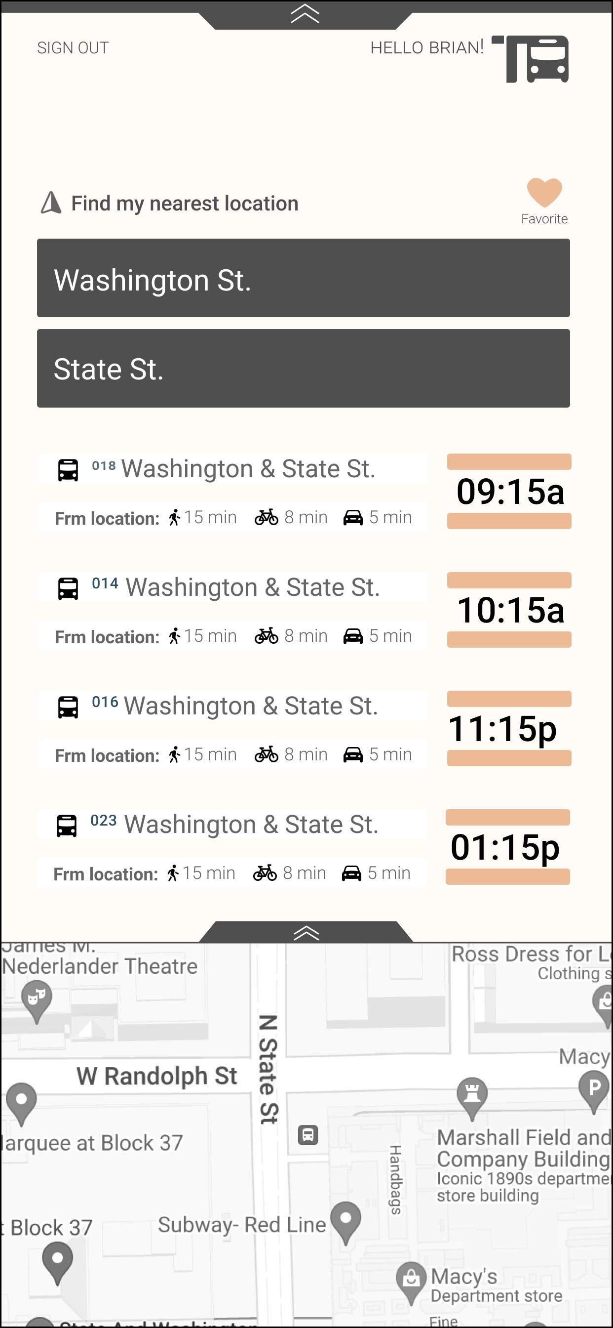
After doing A/B testing, it was suggested to add a "location services" option, so the user can automatically be in their direct location without entering it manually. The next discovery during testing, was to create a better onboarding tutorial. The arrows are pointing in a less obvious position for the drag feature.
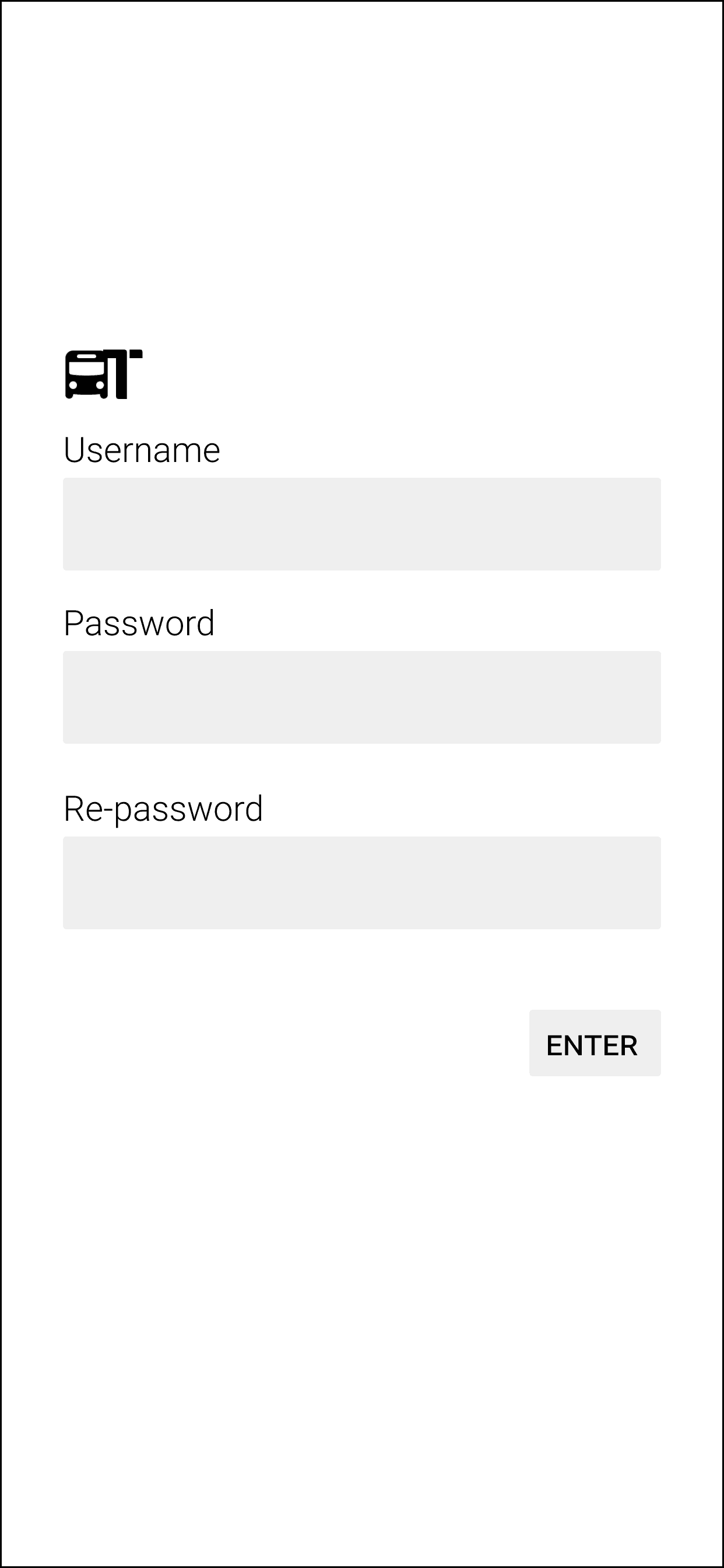
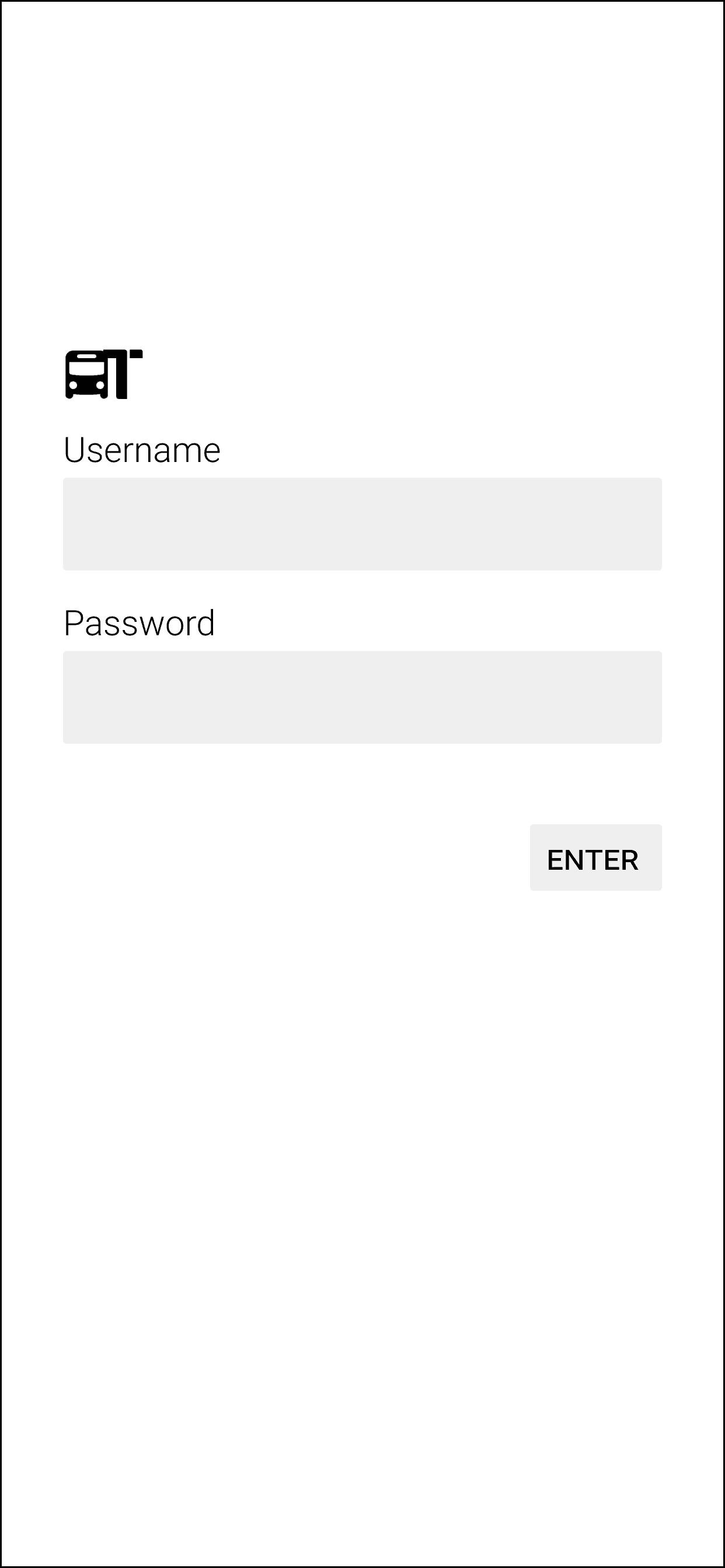
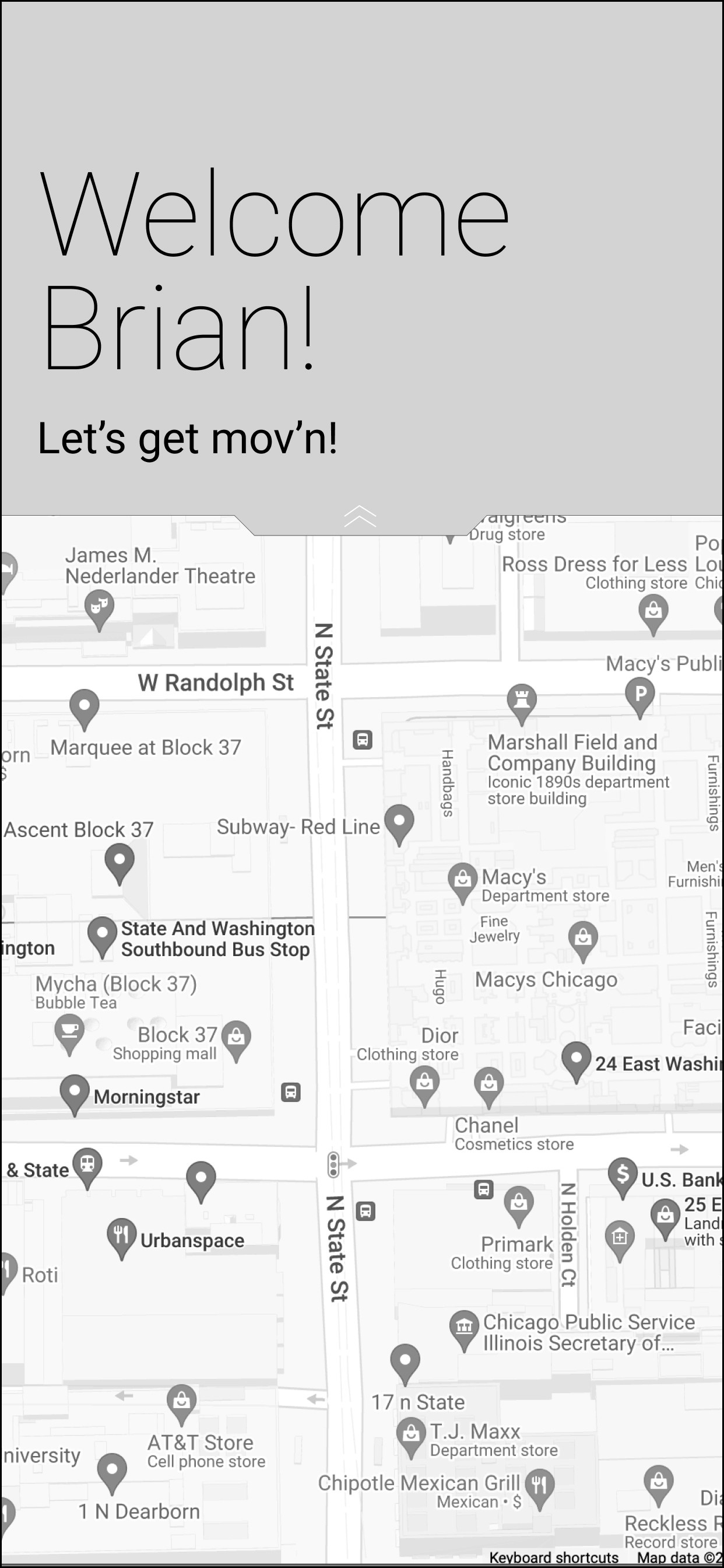
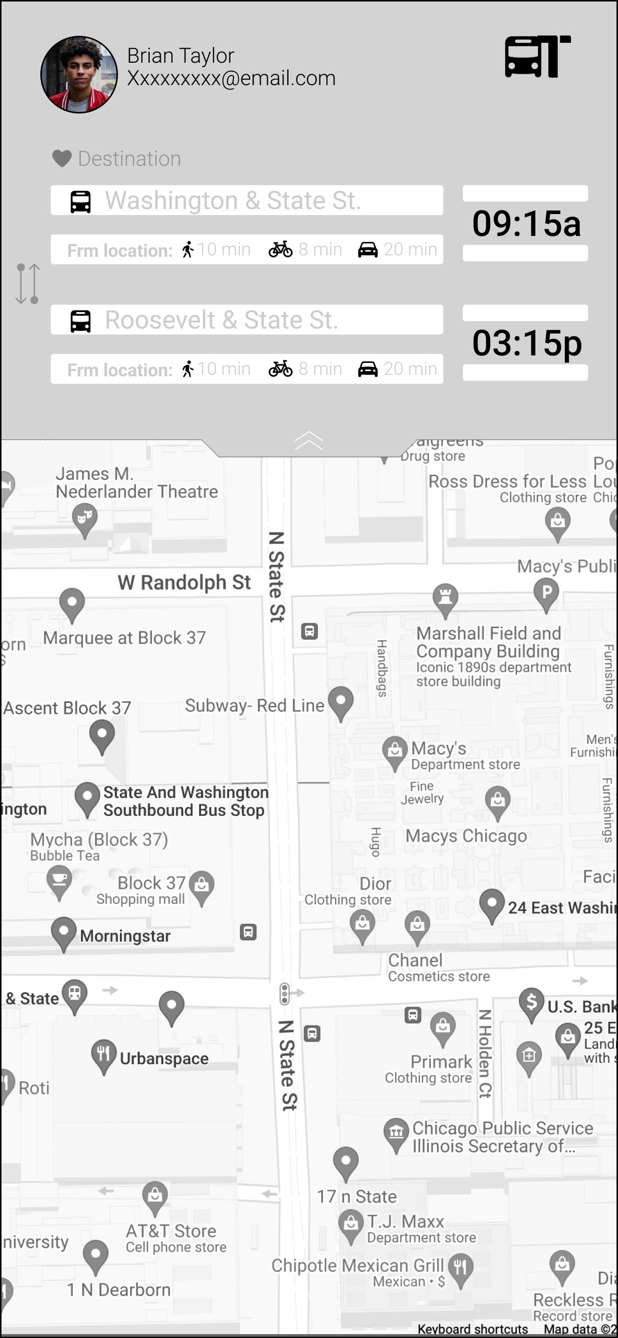
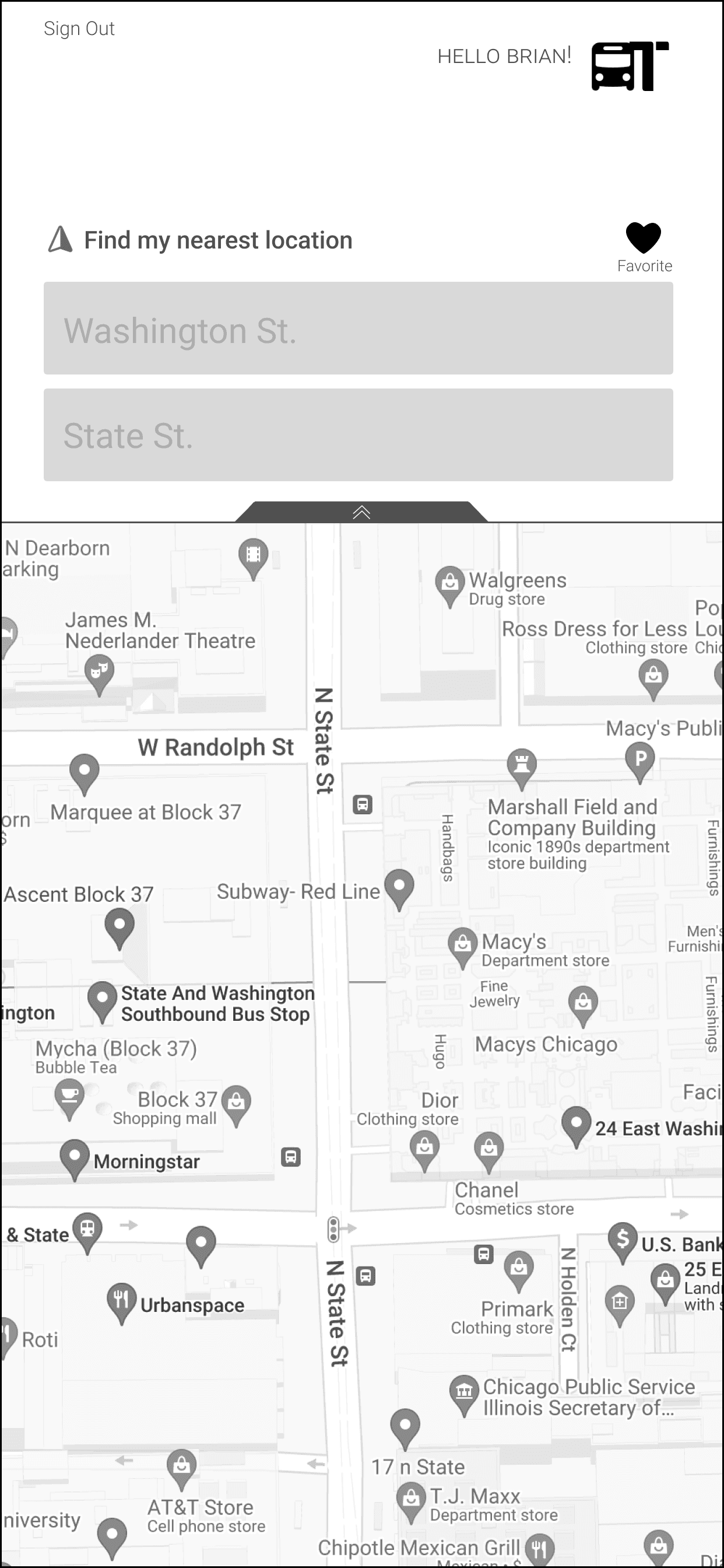
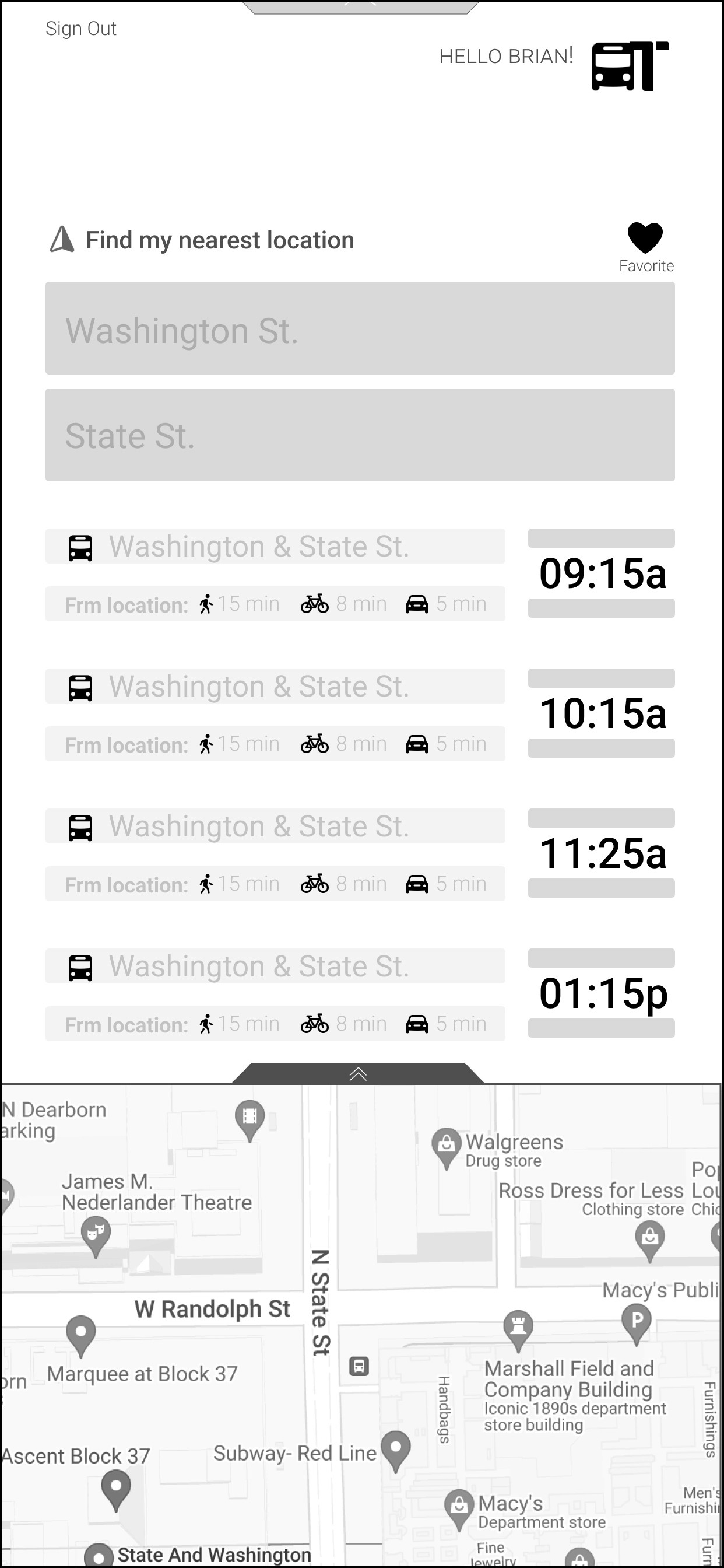
Before
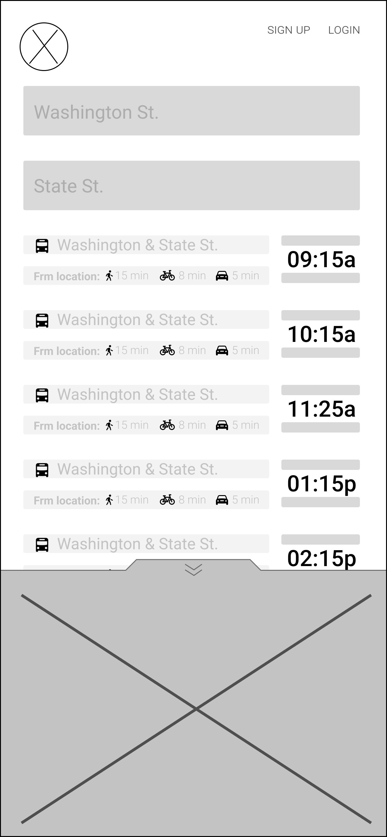
first Iteration
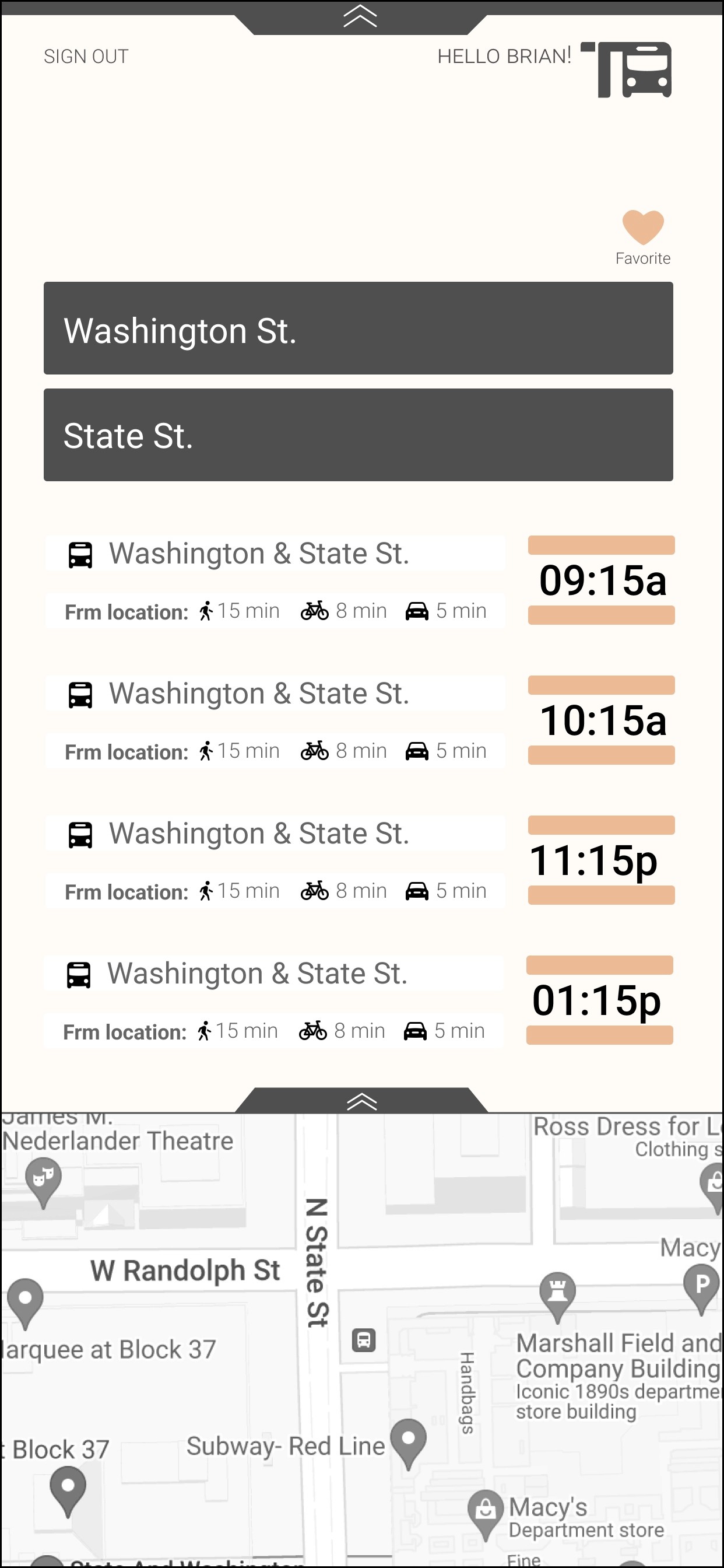
second Iteration
Add in a locations services option
Indicate which bus is arriving, label bus numbers
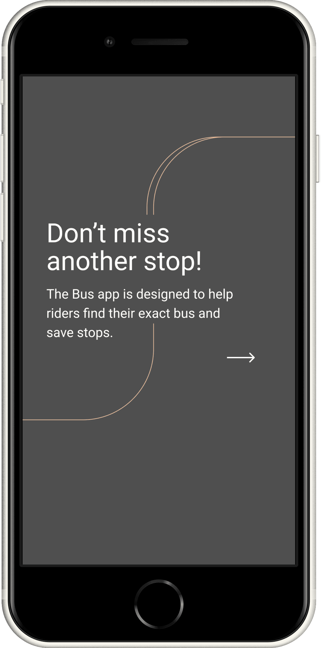
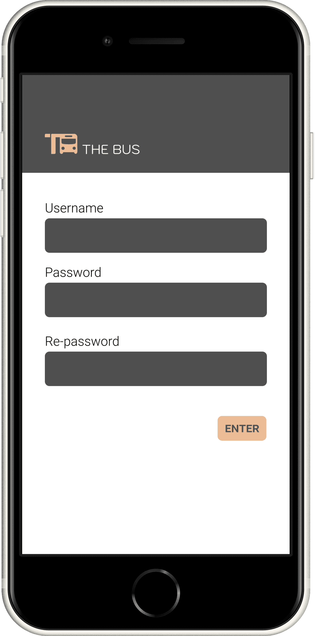
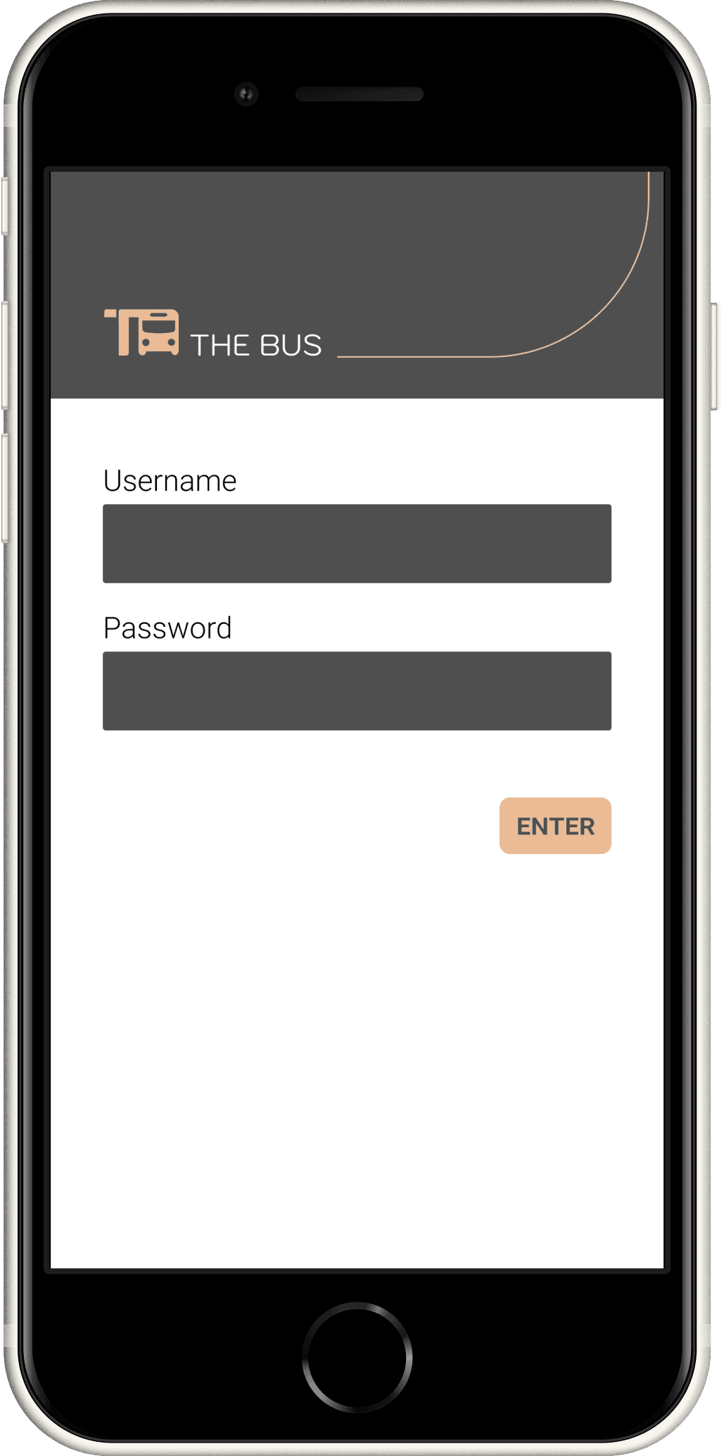
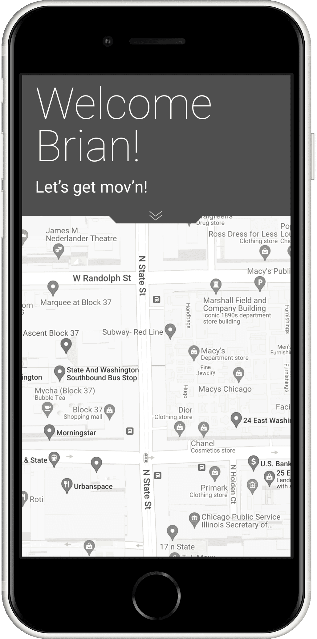
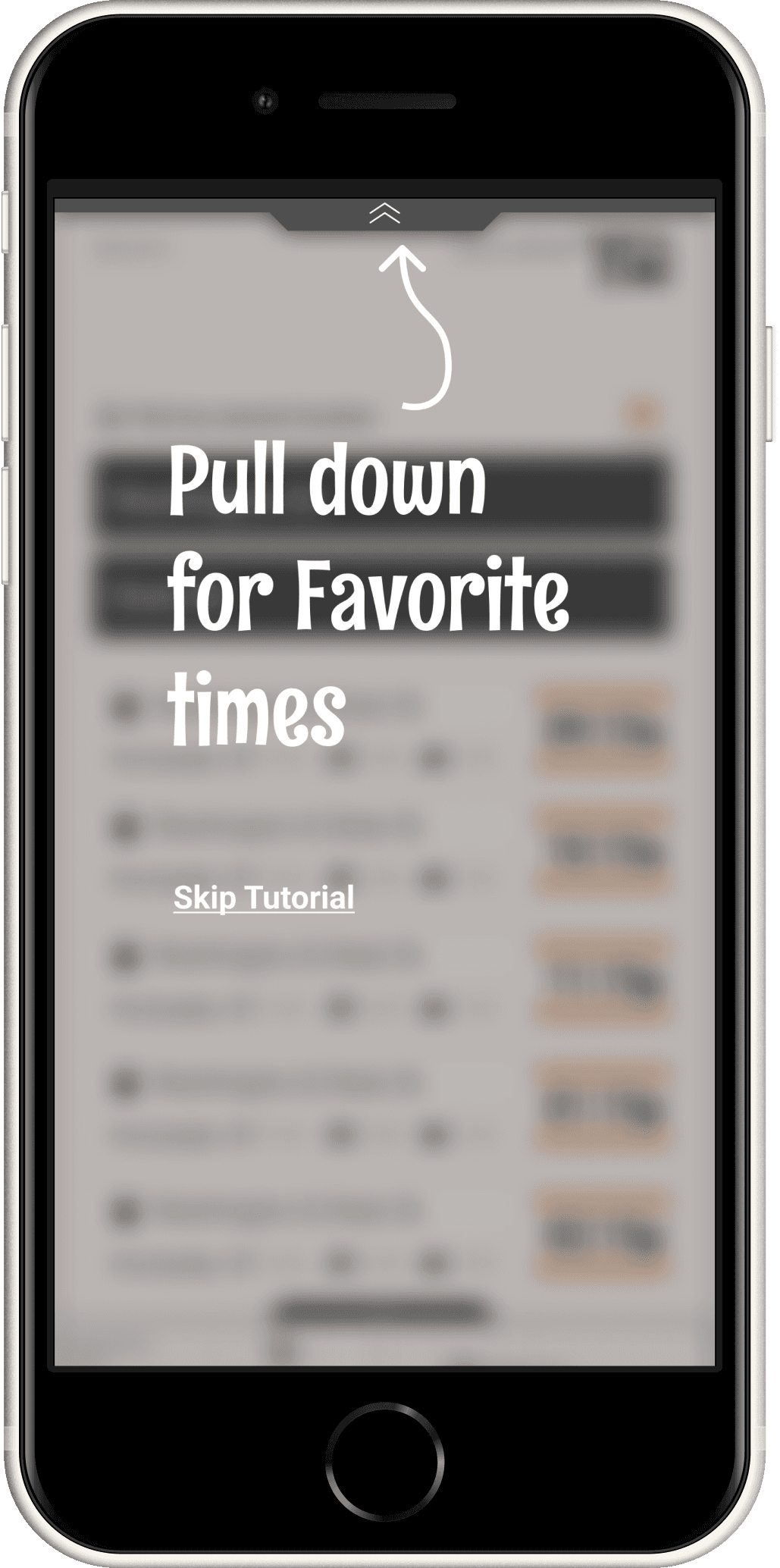
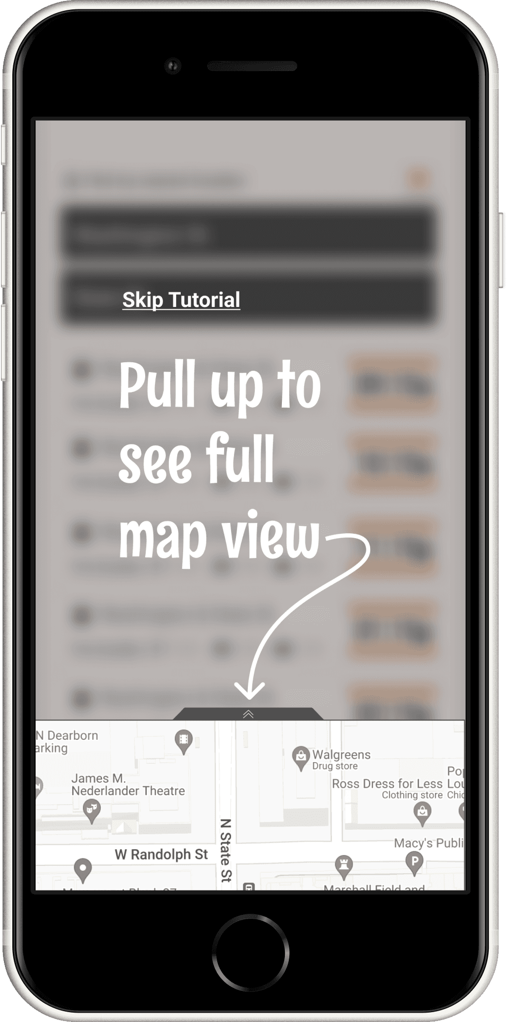
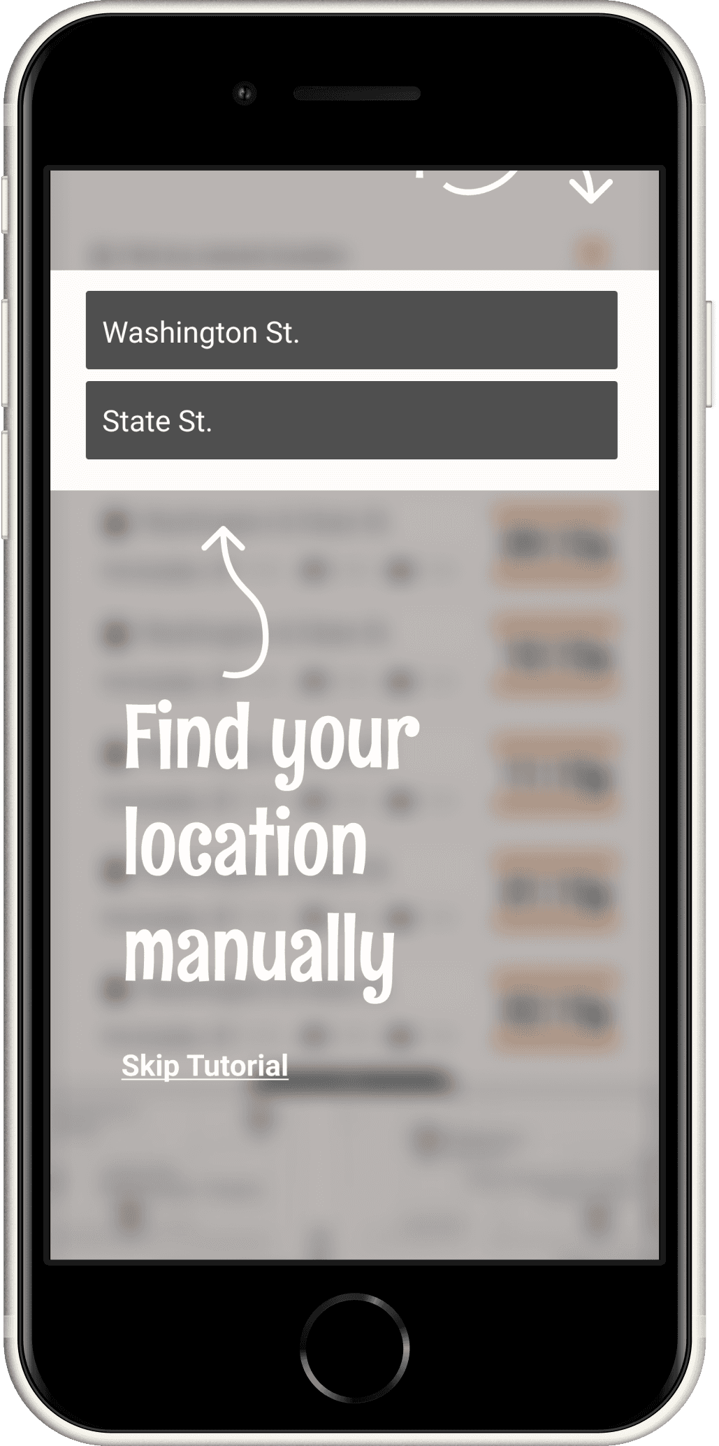
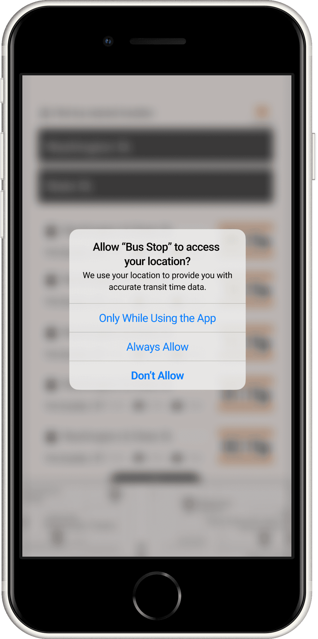
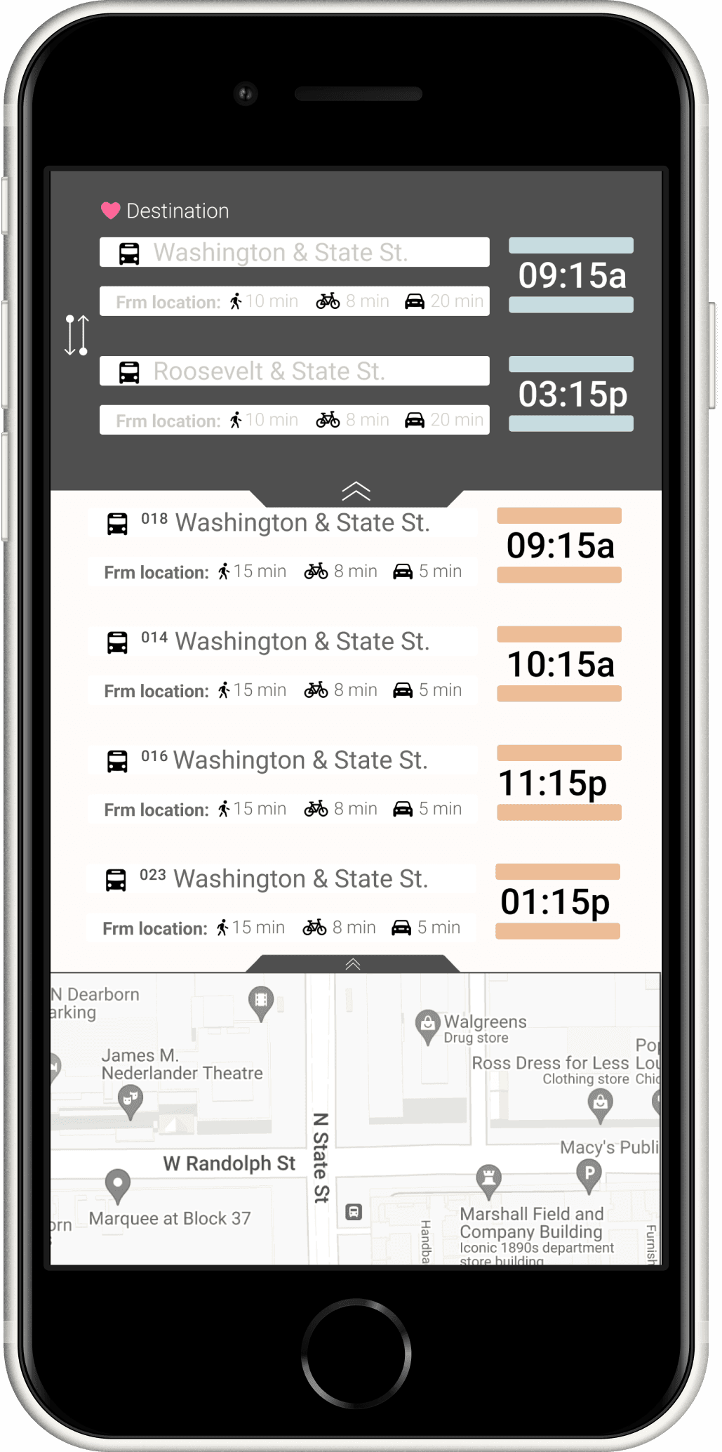
Onboarding
Hi-Fi Iterations
Main Features Screen
Interview Insights
3 Users | Scenario
You are a college student, at the end of your last year.
You have a job interview located near Washington and State.
The Problem is the bus line service has recently added 8 new lines to your closes bus stop.
You need to know exactly which line, services the time you need to catch the right bus.
You want to know how long it will take to get to the bus stop, AND What time the bus is coming.

Feedback
possibly provide reverse option
push notifications, running late
running notification
add in "error" warnings
add "In route"
- ghost trains Ventura app is bad about this.
- Grays out if its not there. Not running
Observations
noticed the users having trouble understanding the tutorial portion and not understanding how to use the drag portions

Strengths
-Effective messaging
-Relevant content
-Responsive design
-Easy set up
-Clear interactive tutorial

Opportunites
-More services offered:
-Metra, Bus,
-L-Train times
-the ability to buy tickets, add credit cards, store balances,
-use app to enter into train gates
SWOT Analysis

Threats
-Moovit app
-Venture app
-ride sharing services: lift, Uber, Taxi's

Weakness
-Push notifications for saved stops
-Providing error notifications
-Providing cancelled bus times
-simple, minimal information for mainstream focus
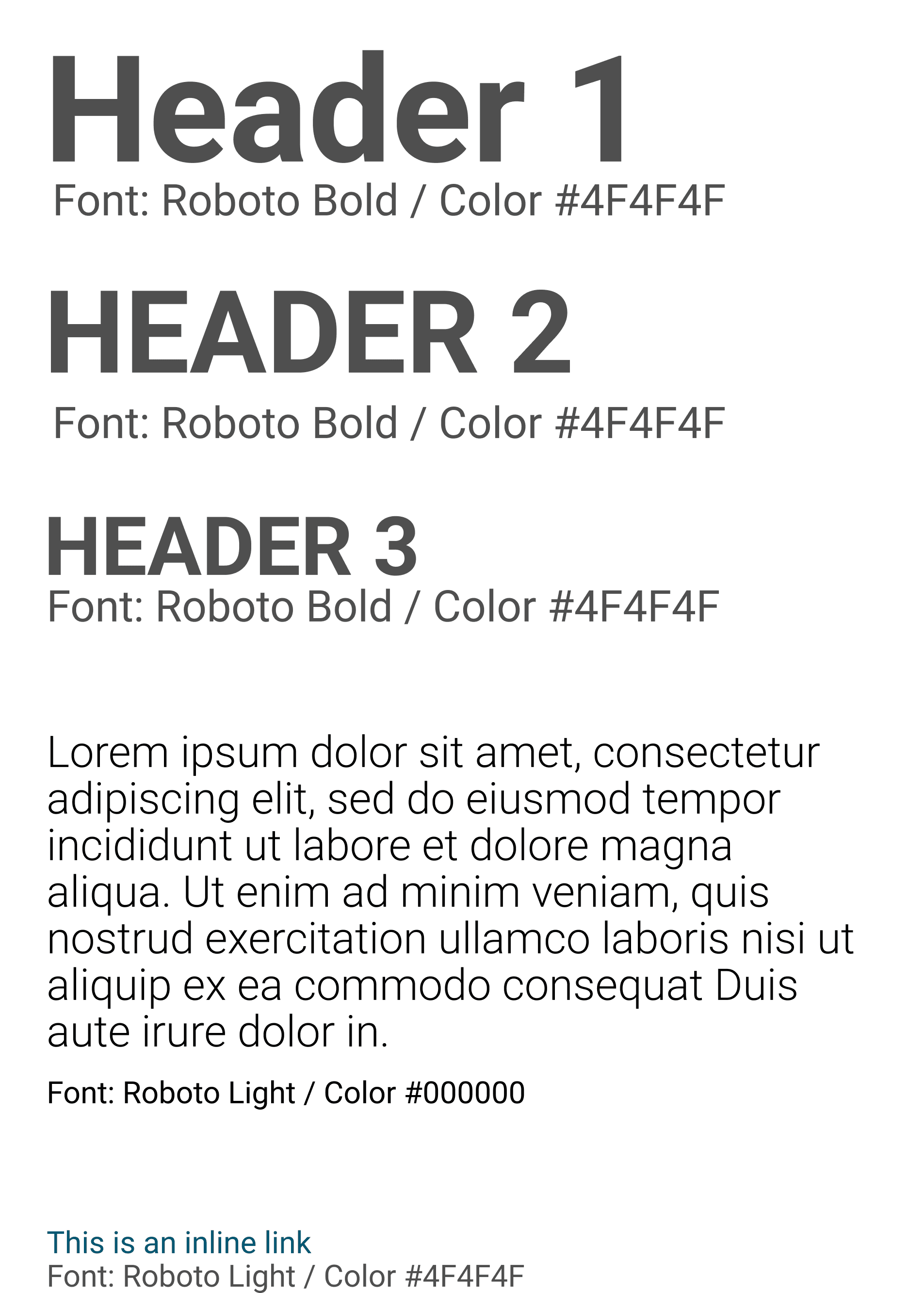

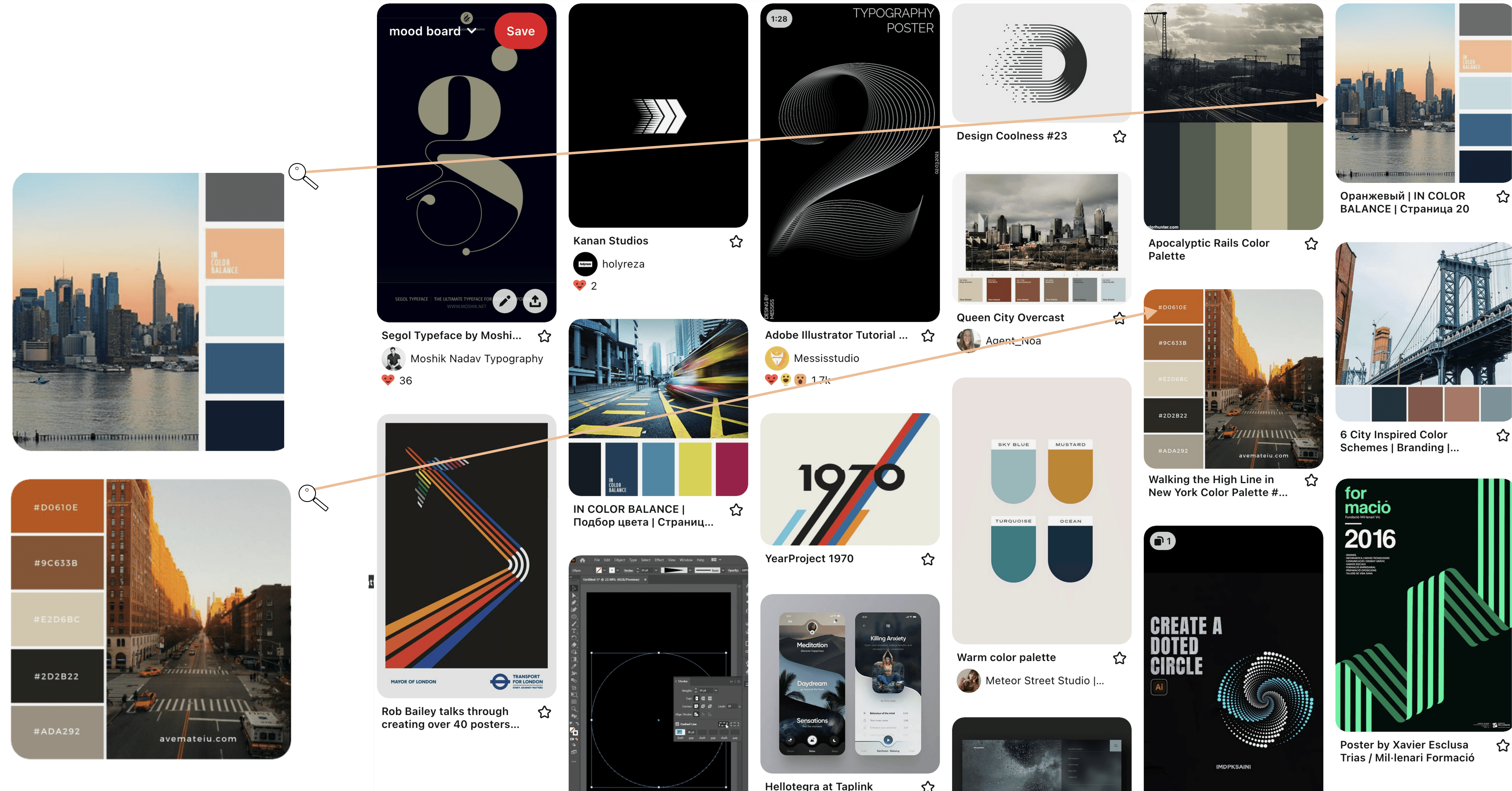
Looking through various color schemes, the color choices and fonts are all meant to demonstrate a clean, yet urban feel. Focusing on rounded edges, muted colors, and earthy blues, tans, and grays.
Branding
Wireframing
Key Drivers
Color
Minimal use of color. Able to identify exactly what they need without getting distracted.
Navigation
All navigation will exist on one page. the user will only need to interact with drag options to complete tasks.
Data
The data is designed to be spacially
balanced and easy to understand
Site Map
The design thinking
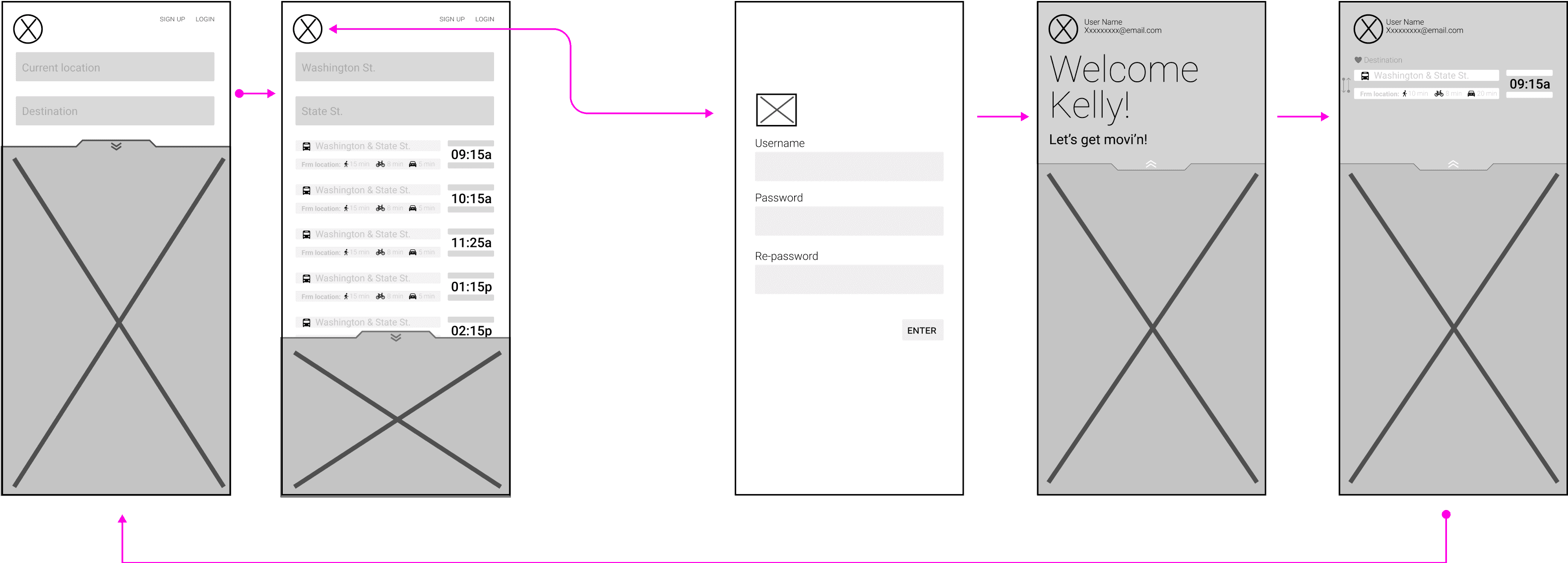
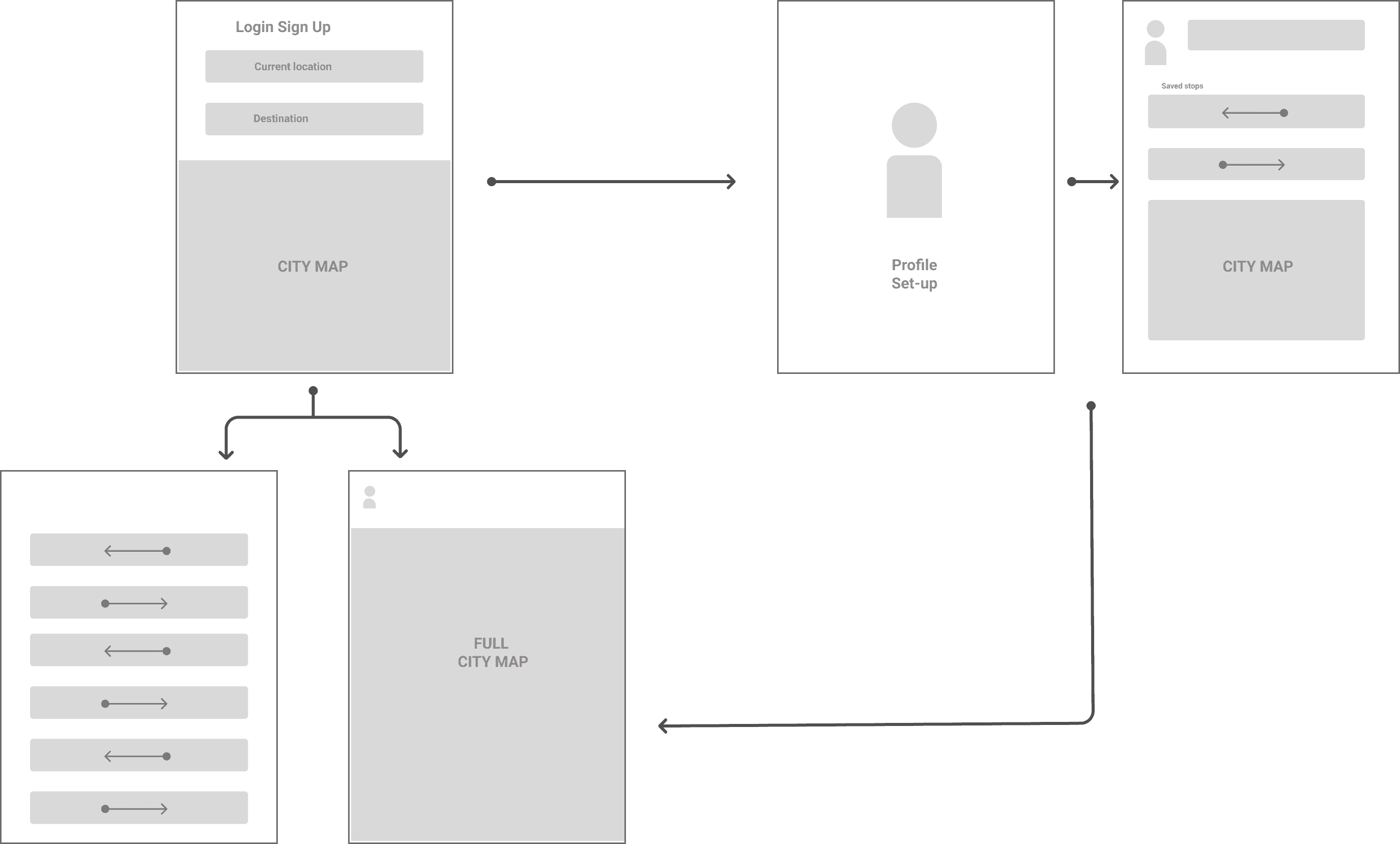
The initial goal is to create as few screens as possible. The thinking is keeping it simple will encourage the user to use app more.
User Flow
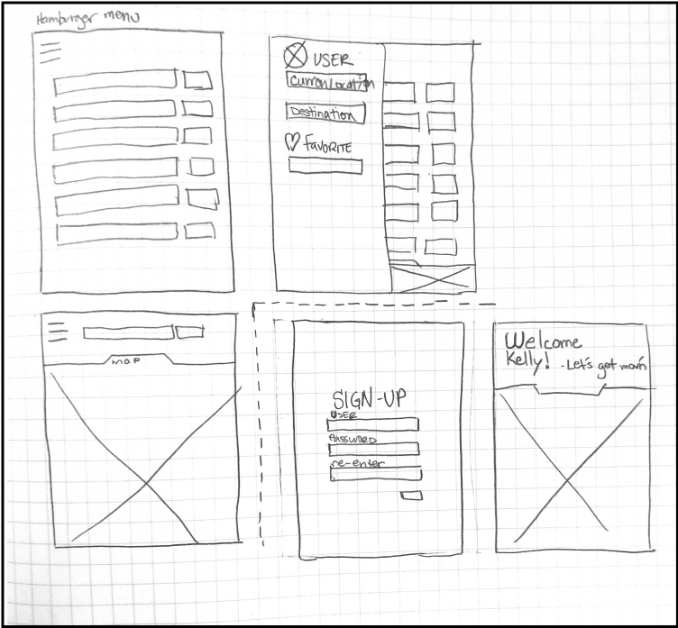
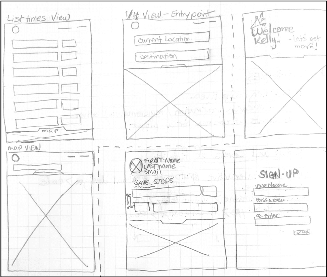
Ideation phase
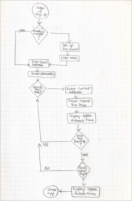
During the ideation phase it was quickly discovered this user flow could be done in fewer clicks
the first rough sketch demonstrates a basic approach, while the vector comp points to a more refined route for the user to take.


What would their fears be? Their concerns?
Not being able to pay for
his books and classes for
the next semester. so he needs sufficient
transportation to school
What would they want as part of their experience?
A well-designed app That is simple and easy to use,
and reliable
What would they try to avoid based on their individual set of circumstances? Being late to work, or school
How would each user likely prefer to research their choices? Online
What other features might each user want in their
ideal bus app? A map to see exactly how far the bus is.
Empathy Map

Brian Taylor
User description: 24-year-old male student with
an part-time job at the student library. He's working towards
a degree in
BA, in Business Economics.

Says
• He needs to get to class on-time

Does
• Plays basketall every Tuesday nite
• Does most of his own grocery shopping
• Is very active socially.

Thinks
• Thinks he's in a good spot with finances, but really cant afford a car
• Thinks I need to be successful
at school.

Feels
• Feels overwhelmed with student/personal life
balance
• Wants to finally be independent
Brian Taylor
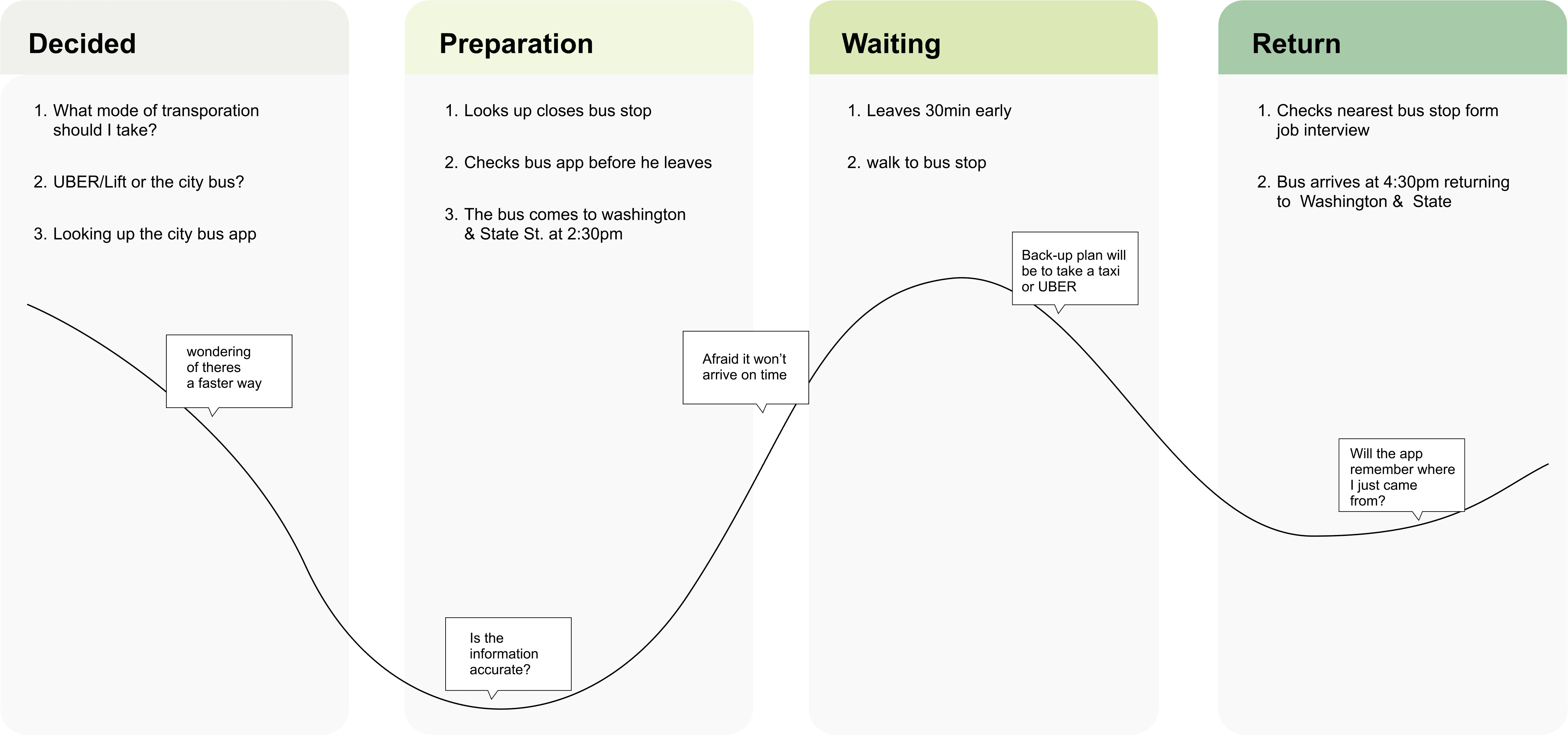
Scenario: Brian needs to catch
the bus for his upcoming
job interview.
Expectations:
• Easy access to find a bus app
• Info to be clear easy to understand
• On-time display times
Journey Map

The Research
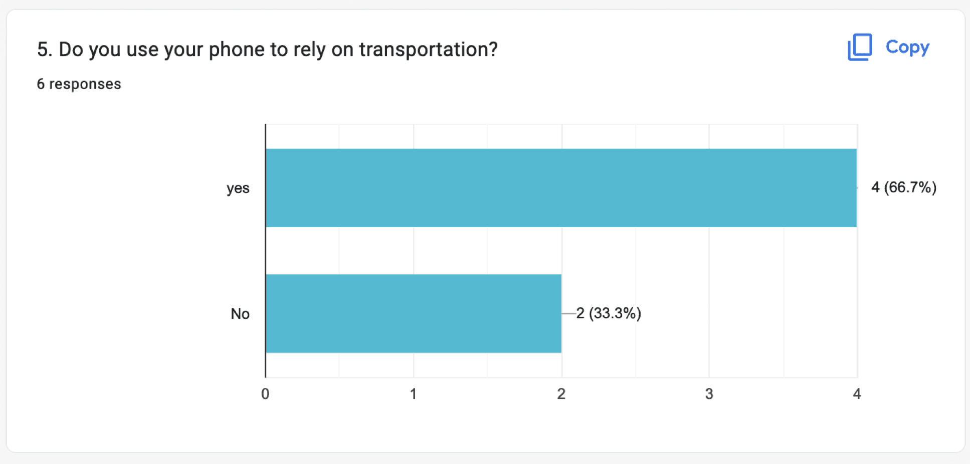
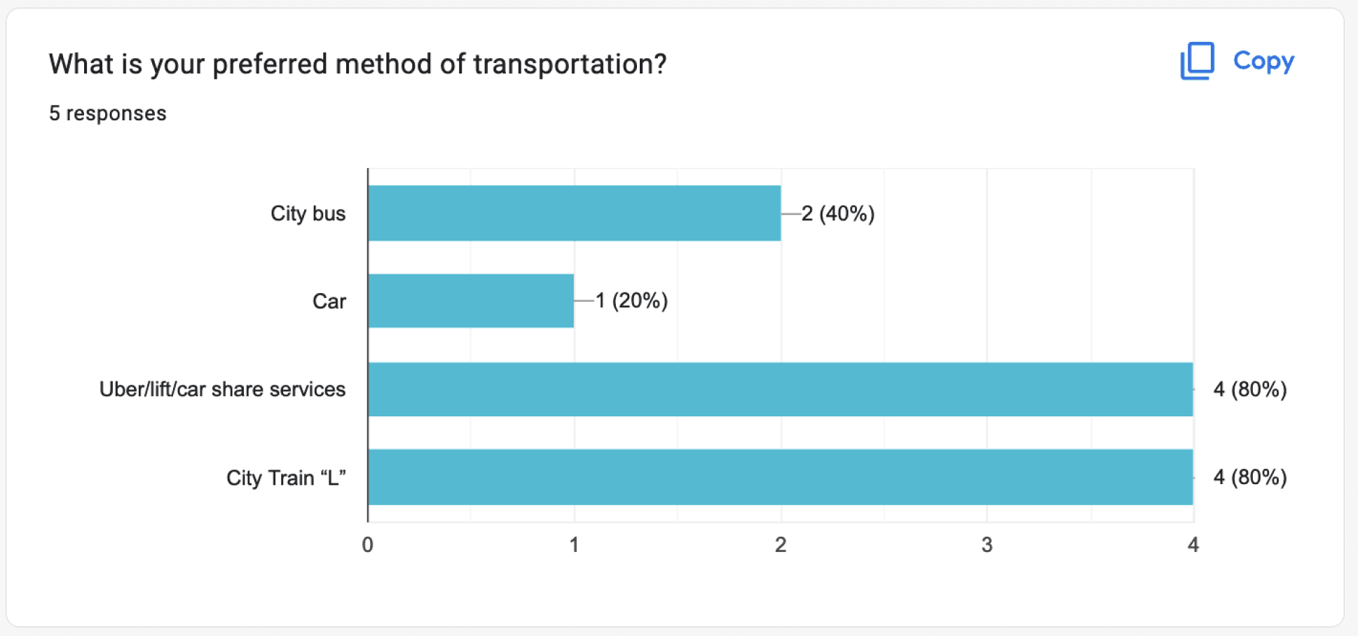
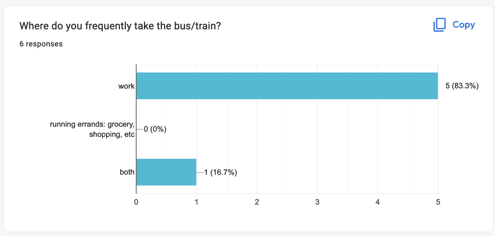
Riders need to know when the bus is arriving and if it’s the correct bus going to their destination
The Problem + Journey = Solution
During the journey of conducting research,
we used primarily the Qualitative Method, Additional research was created thru user personas, journey maps, empathy maps,
& user flows
The solution: provide the riders with an easy and simple app. We’ll do this through eliminating unnecessary pages


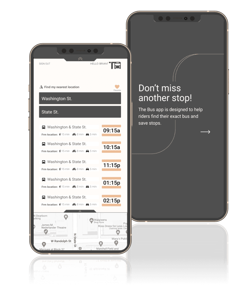
We designed The Bus app to help riders from the inner city take the city bus without the hassle of rushing to the nearest stop and knowing exactly when the bus will arrive. The challenge was 7 new bus lines were recently added specially to the Washington & State St. bus stop, in Chicago. The solution was to create a bus app that could easily direct riders to their nearest stop, and let them know how much time they have until the next bus arrives.
The Bus app

Case Studies
Research Method
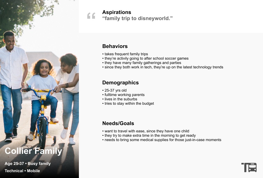
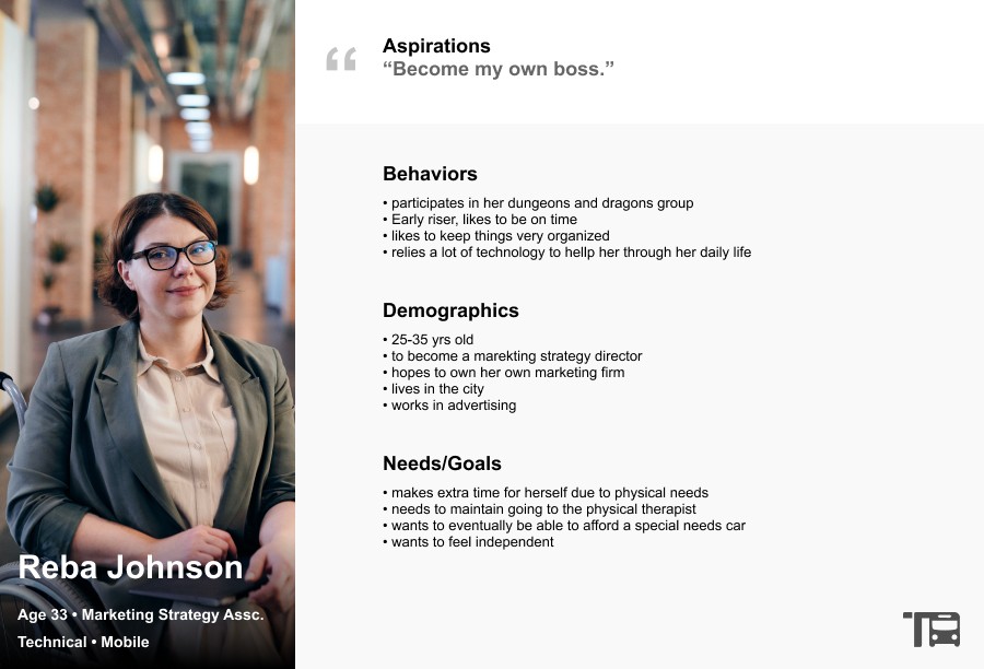
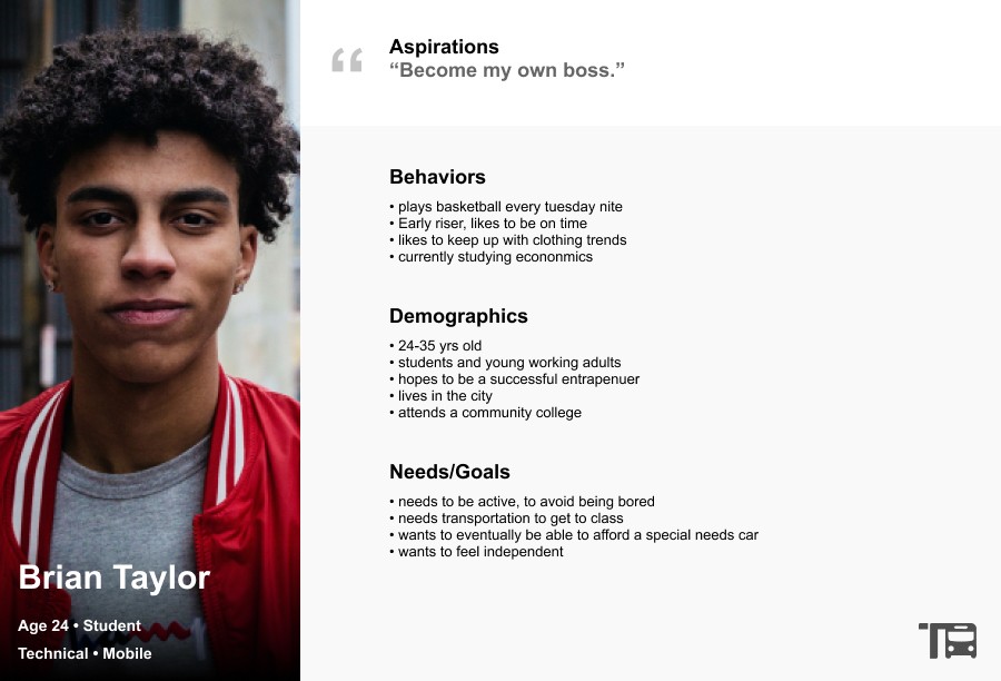
3 users persona's are represented here. Each one focuses on vastly different backgrounds. The Collier Family, is a busy young suburban family, who likes to take frequent trips to the city. Reba Johnson is a young successful Marketing Strategist, who has special needs due to her wheelchair. Brian Taylor, is a young student getting ready to graduate into the financial field.
User Persona's
Moodboards
UI Design
Playing off of the urban street tones, the mood investigated here focuses on simple vectors, rounded edges, light weight lines, and playful imagery with lots of white space.
After one more round of A/B testing, we thought it would be valuable to provide "look ahead" stops for the user to visually see where the bus is located and plan accordingly.
VIEW PROTOTYPE
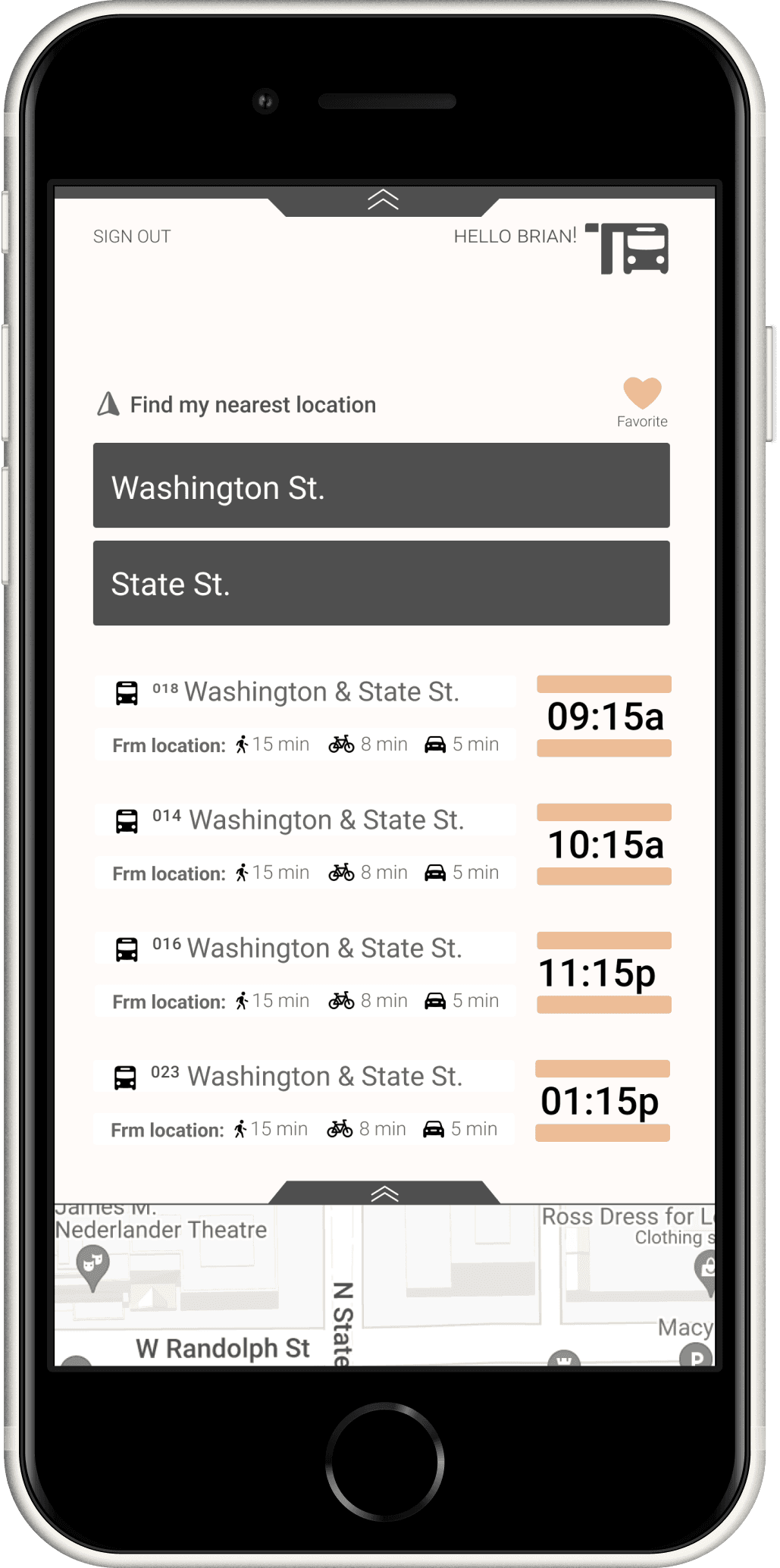
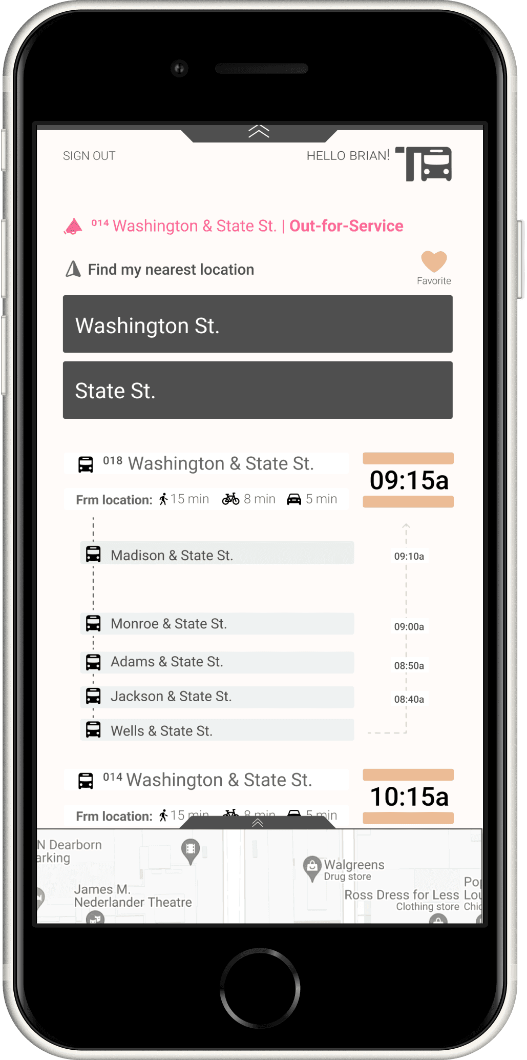
Based on the observations above, and the research, I implemented some of the changes given from the feedback
Improvements to the onboarding tutorial
the ability to favor your bus stops, and reverse said bus stops
the ability to see when a bus is out for service by providing delayed messages or error notifications if something has gone wrong
Key Takeaways
Ideation phase
During the ideation phase it was quickly discovered this user flow could be done in fewer clicks
the first rough sketch demonstrates a basic approach, while the vector comp points to a more refined route for the user to take.


